+7 (910) 732-24-45

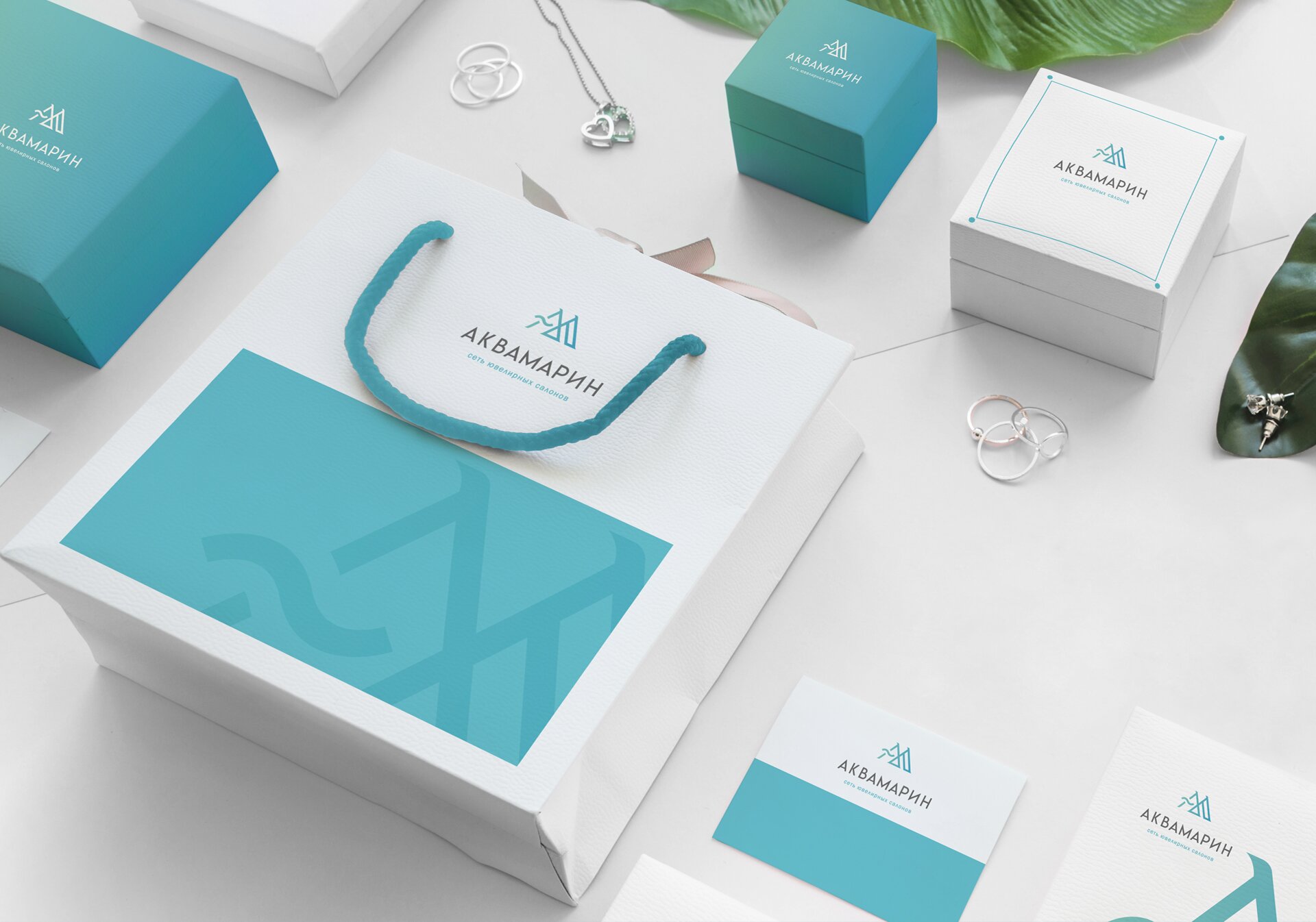
AQUAMIRIN jewelry store chain has been on the market for a long time and has 6 outlets. Despite this, there was no corporate identity. There was only a very old logo. This happens when at the start all the forces are focused on business development, and the logo and identity are not given due attention.
Making any printed layout or layout in instagram caused some difficulties. Work on creating the site was also suspended. There were no uniform standards, and it was not possible to unify and systematize all advertising materials. As the business continues to grow rapidly, there was no point in waiting any longer. We needed a REBRANDING!
I suggested making a new logo and style and then developing color schemes and graphic techniques in accordance with the new elements for all printed materials.
I offered 3 options. But the most successful and appropriate was one where I developed a monogram. This sign included the first letter of the name and the first letter of the owner’s name (Marina). The result is an interesting symbol that is quite elegant, unique and not like other jewelry.
I used shades of aquamarine (from turquoise to blue) combined with white and pearl.